Production Blog: Transitions
Hey, Sappies. Here again, Char, on the creation of the Charmmercial. Today's topic being the transitions of this wonderful art piece.
Last time, we ended off on the text portion, but today we'll be talking about something more worthwhile. At least something less boring. Now, to be completely honest, transitions can be pretty cringe. And with the limited sources CapCut gives us, it was hard to choose. But because I'm practically an expert, the final product looks beautiful. (If cringe could be made to look beautiful.) So with that, let's just get right into it.
I started off experimenting with simple transitions, like fades and glitches. But I soon realized that if I wanted people to find my commercial interesting I was going to have to do more than that. I continued to mess around with the tools and realized that, yeah, my commercial was going to have to be a bit cringe. Just because.
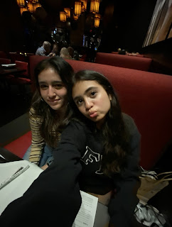
I moved around a few of the pictures and videos and then clicked on the white square with a black line through it that separated each clip. Transitioning to the picture of me kayaking, I went with the "Heart" transitions. From that to the video with my best friends, I chose "Wipe Left". "Kaleidoscope" to the picture of me eating at a restaurant. Then "Blur" to me skating. "Blinds" to me looking all dressed up and fancy. And then "Heart II" to me lip-syncing. It may not sound all that good, but put together it sort of just flows. At least I think it does.
Well, that's all for today. We're almost there. Let's save the final touches for tomorrow, Sappies. Chao.
XOXO,
Char


Comments
Post a Comment